-
Product
-
CREATIVE INTELLIGENCE SUITE
Explore The Suite
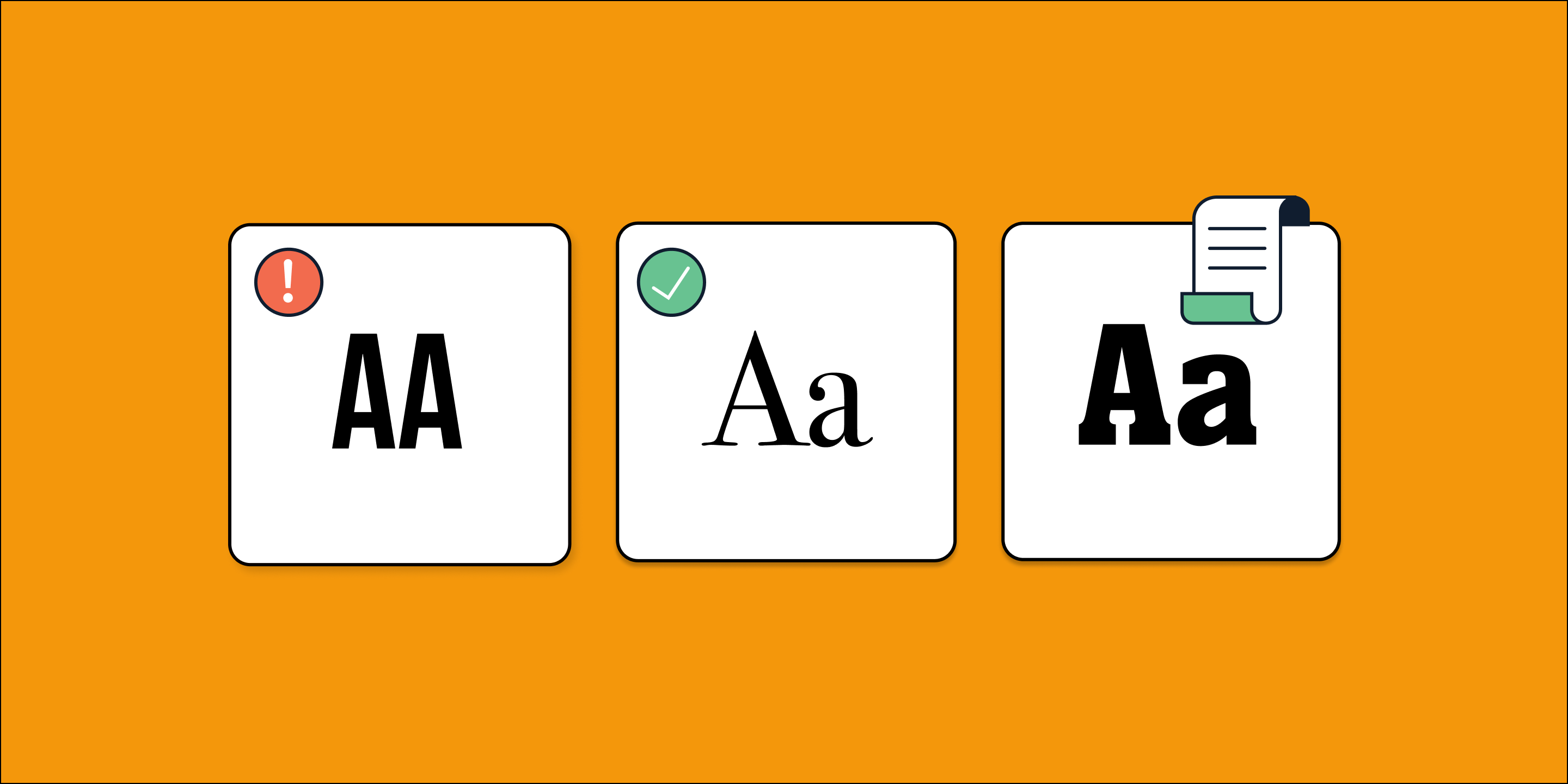
Ensure fonts are licensed and ready for the world to adore.
Scan projects for font usage risks just in time.
-
- Pricing
- Blog